Pixel 4D™ Live Wallpapers
- 4.7
- Rating
- 50.00M
- Installs
- Free
- Price

 Analysis by App-foxy
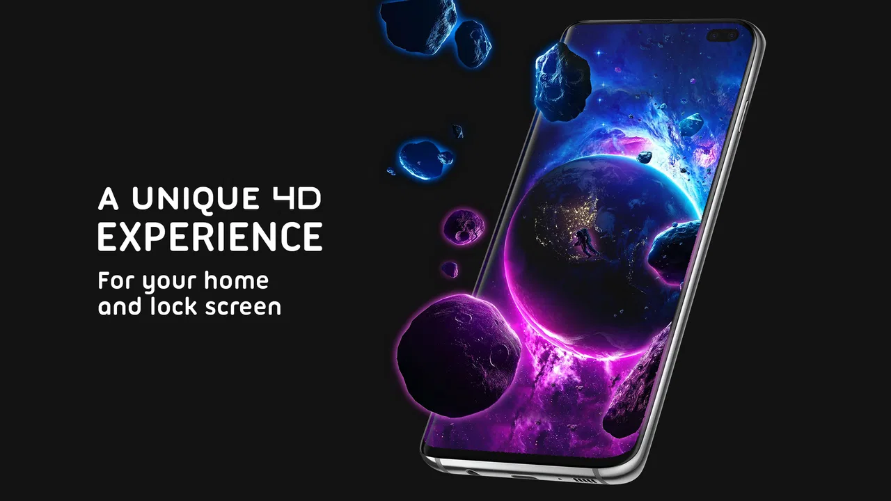
I spent time with Pixel 4D™ Live Wallpapers as a personalization app, paying particular attention to how comfortably it works in different situations rather than judging it only by visual impact. Its main appeal is simple: it turns the phone background into a layered scene that appears to shift with the device, with options aimed at HD, 4K, and animated lock-screen use. That can make an ordinary home screen feel more personal, but the experience depends heavily on how much motion, contrast, and visual activity you find comfortable.
The app comes from TarrySoft and is free to install, with optional purchases ranging from $0.49 to $99.99 per item. It is rated for Everyone, runs on Android 8.0 or later, and its current version is 3.4.6. I see it as a visual customization tool rather than an essential utility: it is enjoyable when you want your phone to feel distinctive, but it is not the right choice if your priority is the quietest, simplest, or most battery-conscious background.
How the interface feels to read and navigate
The first thing I noticed is that the app is built around browsing visual choices. That makes the experience more immediate than a traditional wallpaper picker, because you can judge a scene by looking at it rather than imagining how a still image might fit your screen. The animated previews are useful here, especially when the effect depends on depth. A picture that looks impressive in a thumbnail can feel too busy once icons and clock elements sit over it, so previewing before applying is an important part of the process.
You May Also Like

 Pandora - Music & Podcasts
Pandora’s Music Is Easy to Start, but Harder to Recover
Pandora’s strength is its low-effort path from a seed to a station. Its weak spot is how much confidence it asks you to place in connection, setup, and quiet recovery.

 AccuWeather: Weather Radar
AccuWeather Review: A Quick, Clear Forecast for Everyday Decisions
For everyday plans, the best forecast is the one you can understand quickly. AccuWeather makes rain timing, radar, and local conditions easy to act on, with a few trade-offs.

 Hill Climb Racing
Why Hill Climb Racing Still Turns Crashes Into One More Run
A tiny car, a bumpy hill and one more upgrade: Hill Climb Racing keeps resurfacing because its simple chaos makes every near-miss feel personal.

 AliExpress - Shopping App
AliExpress Makes Global Shopping Feel Personal, but Shoppers Bear the Risk
AliExpress turns a global marketplace into a pocket-sized discovery engine. Its reach is useful, its shopping loop compelling, and its trade-offs easy to miss.

 Lords Mobile: Kingdom Wars
Lords Mobile Is a Kingdom-Building Routine, Not a Quick Match
A case-by-case verdict on the building, battles, device demands, and social commitments that make Lords Mobile rewarding for some players and exhausting for others.

 PDF Scanner app - TapScanner
TapScanner Makes Paperwork Easier to Capture, Check, and Share
TapScanner makes scanning with a phone feel less like a rescue operation and more like a dependable step in getting work done. Its capture tools are useful, though not flawless.
More From Our News Desk
View All News


For someone who reads comfortably and prefers visual selection, this approach is easy to understand. The purpose of each wallpaper is apparent from the image itself, and the app’s focus stays on personalization instead of burying the main task beneath unrelated tools. I found that helpful when I wanted to change the appearance quickly rather than spend time adjusting a large collection of technical settings.
There is also a trade-off in a catalog organized around images. Text can become secondary to artwork, and a user who needs strong labels, stable visual landmarks, or very high contrast may have to work harder to compare choices. The more dramatic wallpapers often contain dark backgrounds, bright highlights, or several layers at once. Those qualities create the 4D illusion, but they can make small interface text and status icons less comfortable to read when the selected image is visually intense.
My practical advice is to assess the wallpaper with your real home-screen layout, not only inside the preview. Place the icons you use most often over it and check whether they remain easy to distinguish. A wallpaper that looks excellent on an uncluttered preview may compete with folders, widgets, and notification badges. This is particularly important for people with reduced contrast sensitivity or anyone who relies on quick visual recognition rather than reading every label.
The app is aimed at Android users and supports devices beginning with Android 8.0. That broad compatibility makes it approachable for people who do not own a recent phone, although the quality of the final result will naturally depend on the display and performance of the individual device. I would not assume that every older handset will show the same smoothness as a newer one simply because both can install the app.
Choosing a background without creating visual clutter
I got better results by treating the wallpaper as part of the interface instead of as a separate decoration. Simple scenes with a clear central subject worked better behind icons than highly detailed images with bright movement across the entire screen. If you use a large clock, calendar widget, or accessibility magnification, leaving quieter areas in the image can make the whole screen easier to scan.
This is one of the app’s less obvious decisions: the most spectacular option is not always the most usable one. A restrained animated background can preserve the personality of the phone while keeping text and icons legible. People who use their device for quick tasks, such as checking a transit time or opening a medication reminder, may benefit more from visual calm than from maximum depth.
Motion, touch, and sensory comfort
The parallax effect is central to the experience. As the phone moves, the layered artwork can appear to shift, giving the impression that the scene has depth. I found that engaging when I was deliberately showing the effect to someone, and it made the lock screen feel less static. At the same time, motion that feels playful in a short demonstration can become distracting when it is present every time you check the phone.
That makes personal tolerance more important than the headline feature. Users who are sensitive to movement, visual flicker, or changing backgrounds should approach the app carefully and test a subtle scene first. I would avoid choosing the most active design immediately. Give yourself time to use the phone normally: unlock it while walking, read a message, switch between apps, and see whether the movement remains comfortable outside a novelty moment.
The effect also introduces a small motor consideration. To appreciate the depth, you need to tilt or move the device, even though basic phone use does not require that action. Someone with limited wrist movement, tremor, joint pain, or a preference for keeping the phone steady may gain little from the interactive part. In that situation, a conventional still wallpaper could be the more inclusive and less tiring choice.
Touch navigation is another area where context matters. Browsing images is generally more approachable than editing a wallpaper from scratch, but selecting a small control or distinguishing several nearby choices may not be comfortable for every user. I would make selections while seated and with the phone held securely, especially if the device is large or the chosen wallpaper encourages repeated previewing.
There is a useful workflow for people who want visual interest without constant stimulation. I would first choose a design with a clear subject and moderate contrast, apply it, and then use the phone for a normal day before deciding whether it is too active. This avoids judging the background only during setup, when novelty can disguise fatigue. It also helps reveal whether the lock screen remains readable when notifications appear.
When the animation helps and when it gets in the way
For a personal phone used mainly at home, the movement can be a pleasant cue that makes the device feel more individual. It may also help someone distinguish their phone quickly from similar devices on a desk, provided the image is not so busy that it becomes hard to identify. On the other hand, a constantly changing background may be unsuitable in quiet workplaces, classrooms, shared spaces, or situations where a bright animated screen could draw unwanted attention.
People who use their phone in low light should also think about brightness and contrast. A vivid background can feel harsher in a dark room than it does in daylight. I would test the lock screen at the times and places where you normally check the phone, rather than assuming that a comfortable daytime preview will remain comfortable at night.
Situational access in everyday use
I found the app most convincing in short, ordinary moments: picking up the phone after it has been sitting on a table, checking the lock screen before leaving home, or showing a friend a new visual effect. The personalization is immediate, and the change does not require learning a complicated creative editor. That simplicity is a real strength for users who want a finished result rather than a project.
A realistic example would be someone who keeps the phone on a stand while working. A layered scene can make the device easier to recognize at a glance, but the same animation may become a distraction if the screen wakes frequently for notifications. In that case, I would select a darker, less detailed design and avoid placing important widgets over the busiest part of the image. The goal is not just to make the phone attractive; it is to preserve the information you need to see quickly.
The app can also suit people who enjoy changing their surroundings to match a mood, interest, or season. Because the focus is on ready-made visual scenes, it is less demanding than creating an image manually. That makes it approachable for users who are comfortable choosing from examples but do not want to learn image-editing software.
However, the free entry point should not be confused with a completely frictionless experience. Optional in-app purchases are part of the model, and the range reaches from $0.49 to $99.99 per item. I would browse with a clear idea of what I am willing to spend and pay attention before confirming anything. Someone looking for a fully predictable, no-purchase personalization tool may prefer the wallpapers already included with the phone or a simpler gallery app.
The app’s audience is broad: it is suitable for Everyone, and the visual concept is easy to understand without specialist knowledge. That does not mean every wallpaper is suitable for every person. Age suitability and sensory comfort are different questions. A child may enjoy the movement, while an adult who experiences discomfort from animated visuals may find the same feature unpleasant. Families should choose designs together rather than treating the age label as a guarantee of universal comfort.
How it compares with ordinary wallpaper choices
The usual built-in wallpaper picker is better when you want speed, stability, and minimal decision-making. A still image normally produces fewer distractions, and it is easier to predict how icons will look over it. A standard photo app is also preferable if you want to use a personal picture, crop it precisely, or keep the background visually meaningful without adding motion.
Pixel 4D™ Live Wallpapers is more distinctive when depth and animation are the point. It gives the home or lock screen a stronger sense of personality than a basic still image, and the preview-based browsing makes that difference visible before applying it. The trade-off is that the visual effect can compete with readability, comfort, and simplicity. I would choose it for expression, not for the most restrained interface.
Another practical difference is maintenance. A still wallpaper tends to remain visually consistent, while a moving design asks you to consider how it behaves whenever you tilt the phone, wake the screen, or read over it. That is not a problem for everyone, but it is an extra layer of attention. Users who already keep their home screen carefully organized may appreciate the effect only if they are willing to adjust icon placement and widgets around it.
Remaining barriers and points to consider
The biggest limitation is that visual customization does not automatically equal accessible customization. The app’s central attraction depends on movement, depth, and detailed artwork, yet those same qualities can make the screen harder to read or more tiring to use. I would have liked the experience to feel equally strong for people who need a very quiet, high-contrast background, but the concept naturally favors visual activity.
Performance is another consideration. The app supports HD and 4K-oriented wallpaper content, but a phone’s display and hardware still shape the result. On an older or less powerful device, I would be realistic about whether a detailed animated background is worth the possible extra visual or system workload. I would also keep an eye on how the phone feels during normal use after applying one, rather than assuming that the advertised resolution alone determines quality.
There is a social barrier too. A moving lock screen can be eye-catching, which is fun in the right setting but awkward in a meeting, a cinema, a classroom, or a quiet conversation. If your phone is often visible to others, a calmer choice may communicate more consideration. A personalization app should fit the environment, not just the owner’s taste.
For users with low vision, I recommend prioritizing the relationship between the image and the icons. Choose a background with an open area behind frequently used shortcuts, avoid placing the brightest details beneath text, and check the result with the phone’s usual display settings. For users sensitive to motion, start with the least active-looking scene available and stop using it if checking the phone causes discomfort. These are practical adjustments, but they cannot remove the fact that animation remains the app’s defining idea.
People who need dependable visual consistency may also be better served by a static wallpaper. That includes anyone who uses the lock screen as a reliable information surface, anyone who finds changing patterns tiring, and anyone who wants a background that never competes with notifications. In those cases, the app is not a poor product; it is simply solving a different problem.
My inclusive verdict
After using it as a personalization app, I think Pixel 4D™ Live Wallpapers is a strong option for Android users who enjoy animated depth and want a more expressive screen than the usual still background. TarrySoft has focused the experience on visual discovery, and the result is easy to appreciate without becoming an image-editing project. Its 4.7 average from around 1.1 million ratings and over 50 million installs show that the concept has reached a large audience, although popularity alone does not settle the comfort question.
I would recommend it to someone who likes changing the phone’s appearance, enjoys parallax movement, and is happy to spend a little time testing readability. I would especially suggest choosing the background around the way you actually use the phone: leave quiet space for icons, check it in low light, and consider whether notifications make the scene too busy. Those small choices make a bigger difference than simply selecting the most dramatic preview.
I would skip it, or choose a static alternative, if motion causes discomfort, if you need maximum text clarity, or if you want a completely predictable free experience without optional purchases. The Everyone rating makes the app broadly approachable, but inclusive use still depends on the individual’s vision, motor comfort, sensory preferences, device, and surroundings.
My final view is positive but measured. This is a fun visual upgrade rather than a universal improvement. When its animation matches your tolerance and your screen layout, it can make the phone feel genuinely personal. When readability, calmness, or consistency matters more, the ordinary wallpaper picker is likely the better tool. The best result comes from treating the moving background as part of your phone’s usability, not just its decoration.
FAQs for Pixel 4D™ Live Wallpapers
01What is Pixel 4D™ Live Wallpapers, and how does it enhance my device's display?
Pixel 4D™ Live Wallpapers is an app that offers a dynamic collection of 3D live wallpapers that bring your device's screen to life. With its unique parallax effects, the app gives the illusion of depth, making your screen visually appealing and interactive. It’s perfect for users who want to personalize their devices with vibrant, moving images.
02Can Pixel 4D™ Live Wallpapers impact my device’s battery life?
Live wallpapers can have a slight impact on battery life due to their continuous movement and rendering graphics. Pixel 4D™ Live Wallpapers is optimized for performance, but it's always advisable to monitor battery usage and adjust settings if you notice significant drain. Using simpler wallpapers or adjusting animation settings can help conserve battery.
03Is Pixel 4D™ Live Wallpapers compatible with all smartphones?
Pixel 4D™ Live Wallpapers is compatible with most Android devices that support live wallpapers. However, performance may vary depending on your device's specifications. It’s recommended to check the app's compatibility on the Google Play Store or Apple App Store to ensure a smooth experience without any lag or crashes.
04Are there customization options available within the app?
Yes, Pixel 4D™ Live Wallpapers offers various customization options. Users can select from a wide range of wallpapers and adjust the parallax effect to suit their preferences. The app allows you to set different wallpapers for the lock screen and home screen, providing a personalized look to your device.
05Does Pixel 4D™ Live Wallpapers require an internet connection to function?
An internet connection is necessary to download new wallpapers and updates. However, once downloaded, the wallpapers can be used offline. This allows users to enjoy the app's features without needing constant internet access, making it convenient for use anywhere.
Pros
- Stunning 4D effects enhance visual appeal.
- Wide variety of themes to suit all tastes.
- Battery optimization feature available.
- User-friendly interface with easy navigation.
- Regular updates with new wallpapers.
Cons
- Certain wallpapers require in-app purchases.
- Ads can be intrusive during use.
- May consume more battery on older devices.
- Limited free content compared to premium.
- Requires internet for initial downloads.

Pixel 4D™ Live Wallpapers
Gallery